Please wait while your request is being verified...


12 Best Fonts for Academic Papers in Microsoft Word
Good academic papers deserve good academic fonts. You might not have thought too much about which font you use before, but they play a big part in whether people will take your paper seriously or not. This article will explore the best fonts for academic papers.
Best Fonts for Academic Papers in Microsoft Word
The best fonts for academic papers are Times New Roman, Baskerville Old Face, and Georgia. There are plenty of good options, but you’ll mainly want to stick to serif fonts. They look much neater and more professional while showing that the reader can trust what you say.
Times New Roman
Times New Roman is the most famous font on Microsoft Word. It should come as no surprise that it’s a good pick when writing academic papers. It’s got everything you could possibly need when it comes to professionalism and readability.
Times New Roman is the best font to use in most situations. If you’re looking for a more formal font, you’ll find that Times New Roman ranks very highly on the list, regardless of what else is required.
It’s a fairly small font, which looks more appealing for an academic paper. A common pitfall that most people fall for is they try to use a font that’s too large, which can make their paper look less trustworthy and more informal. Neither of those traits is good for academics.
Baskerville Old Face
Baskerville Old Face is a great font to use in an academic paper. There have been studies in the past about different fonts and how they engage readers. It’s believed that Baskerville is one of the most reliable fonts, and the writer tends to be more “truthful” when using it.
Whether you buy into studies like this or not isn’t important. What is important is that Baskerville Old Face is a fantastic choice for most academic papers. It looks really good (like a more concise Times New Roman), and it’s very popular.
Baskerville is a fairly popular choice for published novels, so you might already be familiar with the font style. If you like the way it looks in some of the novels or publications you’ve read, you’ll find that it converts very well to your academic papers.
Georgia ranks very highly when looking for a formal font that will work well in an academic paper. It’s slightly larger than Times New Roman, but a lot of people say that this helps it to become a more “readable” font.
When writing academic papers, it’s wise not to overwhelm your reader with information. The more condensed the font is, the harder it can be to make sense of what you’re writing. With Georgia, this isn’t an issue.
Georgia might be one of the larger fonts listed here, but it makes for an easy read. Plenty of readers will be happy to read through an entire paper written in Georgia, but they might be a bit against reading one in something smaller.
Garamond is another decent option that can work well for academics. Garamond is the smallest font we have included on the list, which can allow you to get a lot of information into a very small space without overwhelming a reader too much.
While it’s not always ideal for including lots of information, Garamond does it really well. It’s readable and professional, allowing your readers to make sense of even the most concise explanations you might include.
It’s also quite a popular choice for many writers. You’ll find that it ranks quite highly simply because of how popular it’s become among a lot of writers on Word.
Cambria is a solid font choice that a lot of people like to use. It’s another default font (though it’s mainly reserved for sub-headings in most Word formats). It runs true to the font size, making it a fairly decent choice if you’re looking for something compact.
The serif style of this font makes it easy to read. It’s nearly indistinguishable from some of the other more popular serif fonts like Times New Roman and Georgia, which is why it is such a popular choice.
However, since it looks so similar, it can make it difficult for people to recognize the font or to figure out which font you’re using. While this isn’t the end of the world, it certainly won’t help you to create a unique feel for your paper either.
Book Antiqua
Book Antiqua is another suitable serif font. It’s not as popular as some of the others, but it looks really good as far as formal fonts go. People like it because it offers a slightly more authentic feel and looks like it could be used in a published novel or academic study.
It’s a standard-sized font, and it’s quite easy to read. A lot of people enjoy using it because it can offer a lot of character to their writing. You might not think that a font has that much power, but you’d be surprised once you try and use Book Antiqua a bit more.
Bookman Old Style
Bookman Old Style is another good font that can look like something out of a published paper. What makes this one special is its size. It’s quite a large font with a decent amount of width to each letter (without going too overboard with the letter spacing).
This font is quite popular for people looking to make their academic papers stand out. It’s not the same style as most of the other serif fonts, allowing your paper to bring a little bit extra that some other people might miss out on.
We encourage you to try this one in multiple different situations. It can work both formally and informally, depending on what you’re looking to get out of it.
Palatino Linotype
Palatino Linotype is a good font for many occasions. You’ll often find it used in academic papers because of the interesting style that comes with it. It looks like a classical font, which takes inspiration from some of the older styles of writing that came before computers.
If you want your academic paper to come across as a bit more traditional or formal, you’ll love this font.
Palatino Linotype offers a great deal of character without changing too much of the original formula that makes fonts like Times New Roman and Georgia so special.
Lucida Bright
Lucida Bright is a great font that is very large compared to most. It works well in academic papers, but you’ve got to make sure you know when to use it. If your paper is particularly word-heavy, it might not be wise to use a font that makes each word much larger.
For example, if you have a page limit on your paper, it might be wise to use a smaller font. Lucida Bright will definitely carry you far over that page limit before you come close to the words you might need to use to explain something.
Nevertheless, it’s still a very attractive font that looks really good in most academic papers. If you’re looking for something that’s stylish and readable, Lucida Bright is a good option.
Calibri is a sans serif font, and it’s the first of its kind on the list. We have only included serif fonts because they tend to be more readable and professional. However, Calibri can work really well if you’re looking for a slightly more approachable feel with your font.
Calibri is like the Times New Roman of the sans serif fonts. It is very popular, and most Microsoft Word versions come with it preloaded as the default font for most written pieces.
That’s what makes it such a valuable choice. You can use it in almost any situation (informal and formal) to a great degree.
Arial is another popular sans serif font that you will be able to use in your academic writing. You don’t always have to use the more formal serif fonts, and Arial is a great example of what can be achieved when you’re a little less formal with your presentation.
Arial is much larger than Calibri when the same font size is used. This makes it a lot more visually appealing, though you have to make sure you don’t overdo it with the number of pages it uses.
Before Calibri replaced it, Arial was also the default sans serif font on Microsoft Word. This has allowed it to be a fairly popular choice for many users, and it remains one of the most popular ones today.
Century Gothic
Century Gothic is the final font we want to cover. It’s a sans serif font that can work really well if you’re looking for a slightly larger font. It’s larger than Arial, making it an easy-to-read font that a lot of people like to utilize.
The only issue you might come across is that the size of it can make it seem much more informal. You should be careful with how you use this font, as it could take away from the professionalism or reliability of your academic paper.
You may also like: 12 Best Fonts for Notes in Microsoft Word 12 Best Victorian Fonts in Microsoft Word 12 Best Chalkboard Fonts for Microsoft Word
- 12 Best Chalkboard Fonts for Microsoft Word
- 12 Best Fonts for Notes in Microsoft Word
- 12 Best Harry Potter Fonts in Microsoft Word
- 12 Best Handwriting Fonts in Microsoft Word

7 Best Fonts For University Essays

When it comes to writing essays for university, the type of font you use can be just as important as the content itself. Different fonts can help set the tone and create a specific mood or atmosphere. Today, we’ll discuss seven of the best fonts to use for your college essays. These fonts are professional yet easy to read, so they’ll help you produce a high-quality paper that will definitely impress your professor!
What are the best fonts for academic essays?
When it comes to university essays, there are a few things that are more important than the font. The content, of course, is the essential part. But the font can also be important, as it can help to set the tone of the essay and make it more visually appealing. As you might already know, some fonts are better suited for academic works than others.
For example, Times New Roman is a classic choice that conveys seriousness and sophistication; but if you want to add a little personality to your essay, you could try a handwriting font like Comic Sans. Anyway, the best font for your school essay is the one that makes your work look its best. So experiment with different fonts until you find the perfect match. And if you’re still not sure what font to use, contact an essay help professional and ask them for advice. Sometimes getting the help we need can easily solve the issue we’re experiencing.
Why is font selection important when writing an essay?
Just as a well-tailored suit can make you look more professional, the right font can make your writing appear more polished. Of course, there’s more to font selection than simply finding something that looks good on the page. For instance, a playful script font might be appropriate for a casual invitation, but it would look out of place in a formal business letter. Likewise, a serious serif font would be inappropriate for a child’s homework assignment.
What are some of the most common types of fonts used in academic papers?
There’s no need to get too fancy when it comes to fonts for academic papers. In most cases, simple is best. Here are seven of the most common types used in academic writings:
- Times New Roman: This classic serif font is a go-to for many writers. It’s easy to read and has a timeless look.
- Arial: A popular sans serif font, Arial is also easy to read and works well for long paragraphs of text.
- Calibri: Another sans serif font, Calibri is slightly more modern than Arial and is a good choice for papers that need to make a strong visual impact.
- Courier: Courier is a classic monospaced font that works well for lengthy blocks of text, such as code or large tables.
- Helvetica: Helvetica is another popular sans serif font that exudes professionalism and simplicity.
- Georgia: Georgia is a beautiful serif font with a slightly more playful feel than Times New Roman. It’s perfect for papers that need a touch of personality.
- Comic Sans : Comic Sans might not be appropriate for all academic papers, but it can be used sparingly to add visual interest or levity to an otherwise dry subject matter. Just use caution with this one – too much Comic Sans can be overwhelming!
How can you choose the right font for your paper’s tone and style?
The font you choose should be legible and appropriate for the tone of your paper. For instance, a formal research paper would benefit from a more serious font, while a lighthearted personal essay could be written in a playful script. In the end, the best way to choose the right font is to experiment with different options until you find one that feels right for your project, as explained above.
What should you avoid when selecting a font for your essay?
While there are a few general guidelines you can follow, ultimately it comes down to personal preference (and the whims of your teacher). That being said, there are a few things you should avoid when selecting a font for your essay.
- Steer clear of any fancy script fonts – they may look nice, but they’re hard to read and will likely decrease your chances of getting a good grade.
- Avoid using excessively small or large fonts; stick to something that’s easy on the eyes and won’t annoy your reader.
- Don’t be afraid to experiment a bit – try out different fonts and see which one works best for you.
Choosing the right font for your university essay is important. The type you choose should be legible, appropriate for the tone of your paper, and easy on the eyes. When in doubt, experiment with different fonts until you find the perfect match.
What are some of your favorite fonts? Let us know in the comments below!
What Are the Best Fonts in Word?
Maybe you’re looking for the ideal font to use for a project. Maybe it’s a resume. Maybe you’re a designer, looking for an appealing Word font choice to recommend to your client.
No matter what the cause, you want to know: what are the best fonts in Word?
“Best” is subjective, so I’ll list the top 10 Word font styles, as well as why they’re the best, and let you select the one you think is right for you.
You may be asking why I’m such a font expert. I'm not a designer, but I have worked extensively with designers. I've also read a lot of content online. That's how I know that no matter how good your words are, you also need to think about the right font to use in that situation for maximum impact.
Let's dive in.
Most used font style in Microsoft Word: Calibri
Today, the default font in Microsoft Word is Calibri, making it the most likely contender for this choice. Microsoft likely picked the Calibri font back in 2007 due to its modern and clean aesthetic with its rounded letterforms and balanced proportion.
Developed by Luc(as) De Groot, it's a Sans-Serif font. It was meant to show off Microsoft's own ClearType technology, which makes text look better on LCD screens.
Here's a nice sample of it:
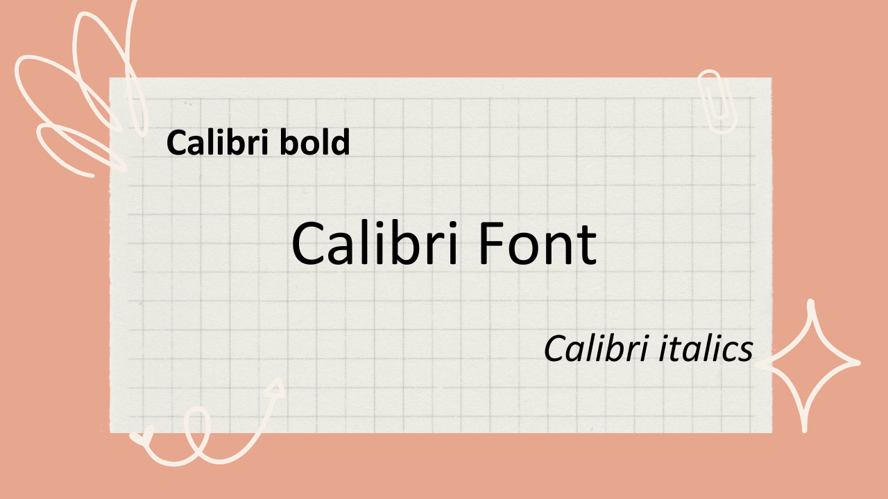
Calibri Font. Image created via Canva.
Ideal font for a school essay: Arial
When it comes to the right font for graded essays, you're looking for a professional and readable ascetic. That means Comic Sans to the back, please.
Calibri is a great choice for it, but I'd select Arial as my top pick for any essays you have to submit. As a clean and modern sans-serif font, Arial offers a straightforward and professional look while maintaining readability.
It was designed by Robin Nicholas and Patricia Saunders for Monotype Corporation in 1982. The font was initially developed as a replacement for Helvetica, which was popular in the graphic design industry but had limited availability for digital typesetting systems at the time.
It's not one of the most decorative fonts, but it looks good and sharp no matter the font size. Here's a sample:
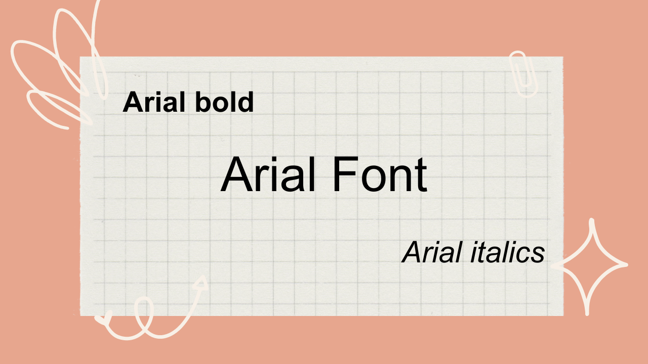
Arial font. Image created via Canva.
Best font for accessibility: Open Sans
This category includes anyone who wants to ensure that readers with dyslexia, screen readers, or any other kind of visual or reading disability can still access your text. Developed by Steve Matteson in 2010, Open Sans is a cousin to Comic Sans MS, and it's an open-source Google font.
I love this font for this purpose because of these features:
Ample spacing: allows for easy reading and comprehension.
Versatility: this font will work in digital, print, headers, body text, and across multiple other mediums.
Recommended by the pros: most importantly, it's recommended in the context of accessibility guidelines, including the WCAG ( Web Content Accessibility Guidelines ).
Aside from selecting a different font, you should also consider factors such as font size, line spacing, and background color should also be considered to create an inclusive and accessible reading experience.
Here's what it looks like:
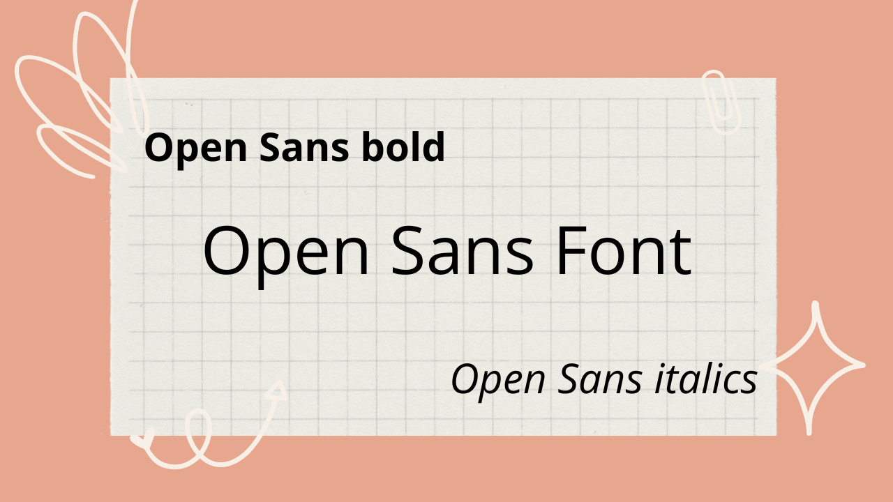
Open Sans font. Image created via Canva.

Top font for your resume: Times New Roman
Unlike essays, you have a new requirement here: you want something that looks pretty. That's why I recommend Times New Roman. It's one of the more decorative fonts, while still remaining firmly readable and professional-looking.
Plus, it's traditional. Developed by British type designer Stanley Morison, it was commissioned by the British newspaper, The Times, in the early 1930s.
Here's a little sample:
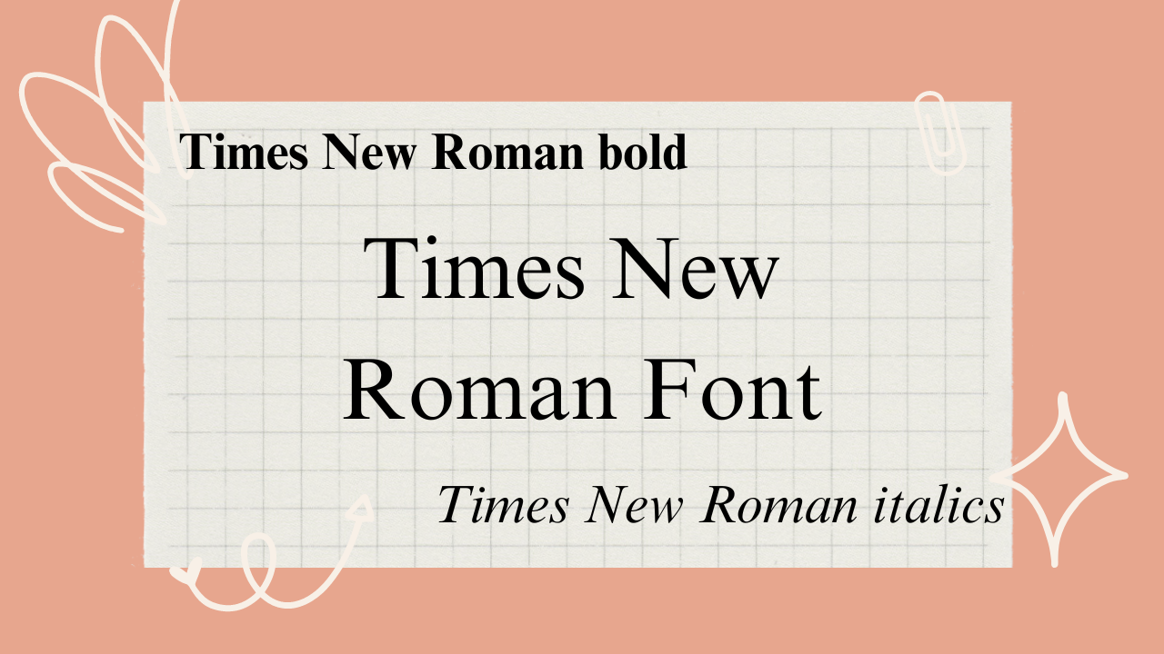
Times New Roman font. Created via Canva.
Top font for designers: Helvetica
I looked on Reddit to see what the top choice was, and most people said Helvetica due to its clean and timeless design. It has a neutral appearance that can adapt well to various design style.
Other fonts mentioned were Montserrat (my personal fave), Roboto, Josefin, Work Sans, Lato, and Mate.
Helvetica is built to spec, too – it was created by Swiss typeface designers Max Miedinger and Eduard Hoffmann in the late 1950s. They wanted to develop a neutral and versatile font that could be used across a range of applications, from advertising to signage and corporate branding.
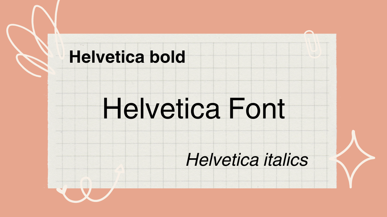
Helvetica font sample. Image created via Canva.
Most readable Word font: Verdana
Many of the fonts I've mentioned above are very readable, but Verdana takes the readable cake. It's a in the sans-serif fonts family, designed specifically for digital screens. Its generous spacing and large x-height contribute to its legibility, especially at smaller sizes.
It was designed specifically for Microsoft by Matthew Carter in the 1990s with wide letterforms and generous spacing.
Curious about what it looks like? Here's a snapshot:
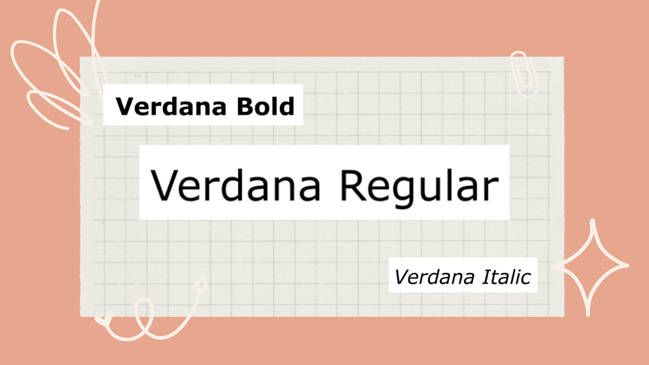
Image created via Canva. Slightly jankier-looking as I had to source samples from Font-samples
Most compatible Word font: Georgia
My home state! And also one of my favorite serif fonts. Georgia is widely supported and available on different platforms. It is commonly used for web content and is considered a highly compatible choice.
Another Matthew Carter original, this one was commissioned by Microsoft as part of their initiative to enhance the legibility of text on computer screens.
Here's a sample:
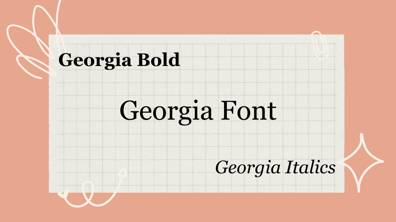
Georgia font sample, created via Canva
Most usable font for your website: PT Sans
PT Sans is a versatile and readable sans-serif font that supports various languages and character sets. It has a neutral design and works well for both body text and headlines. That's why it's so great for almost any website design.
Designed by Russian type designer Alexandra Korolkova, in collaboration with Olga Umpeleva and Vladimir Yefimov, it was released in 2009 as part of the PT Fonts project, which aimed to create a set of free and open-source fonts for public use.
This is what it looks like:
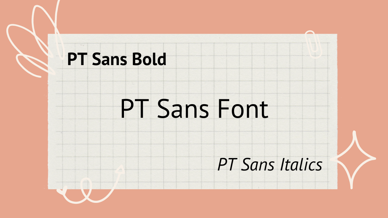
PT Sans font sample, image created via Canva
Best fonts — for you: Your choice!
Honestly, if you've scanned this whole list and haven't found anything suitable, I recommend you spend some time browsing Reddit's designer subreddits and poring through Google Fonts. The world is your oyster.
You don't even have to limit yourself to a particular family. For instance, serif fonts are known in the industry as being more legible, but one study found there was very little difference between a serif typeface and sans fonts.
As I mentioned, my personal favorite is Montserrat just due to its sleek look and attractive sans-yness. But you may be different!
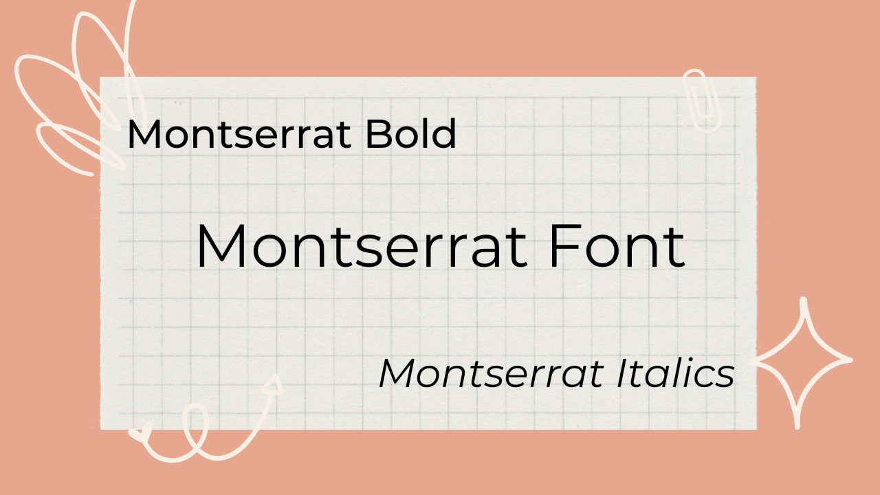
Montserrat (author’s favorite) font sample, image created via Canva,
Bonus: Worst font to avoid
Any kind of cursive font is almost always a no-no in design. Practice your hand calligraphy all you want, but there's a reason the majority of the web uses typewriter-style letters.
Especially for legal documents, web design, or anything else that will be seen and judged by your peers, employers, or colleagues, your font selection should be neat and readable.
I also recommend any kind of special characters, commonly used to differentiate usernames on platforms like Twitter. These are almost impossible for screen readers to parse appropriately.
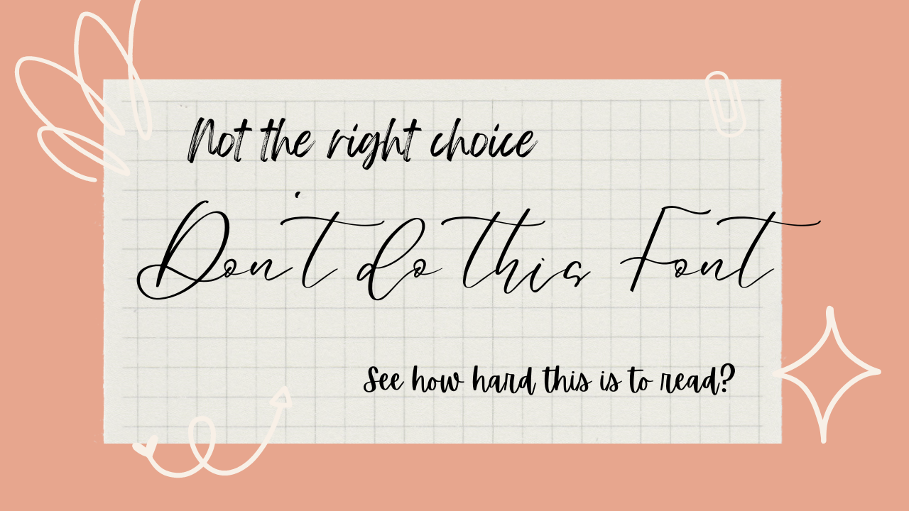
Image created via Canva.
Where can I get fonts?
Bored of Microsoft's own fonts? A great place to look for more is Google Fonts. These are easily downloadable and will work across almost any online context.
What's the difference between a Serif and a Sans font?
The main difference between them lies in their letterform design and the presence or absence of small decorative strokes known as serifs.
If you look at Georgia's G, you'll see it has little ticks on the ends of the letter. By comparison, PT's S has no ticks - it's a clean line.
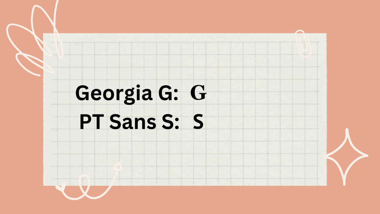
See how the Serif font has the distinguishing ticks, while the Sans font is smooth?
Serif fonts are often preferred for lengthy text passages, such as books and articles, where the serifs aid in guiding the eye along the lines of text. Sans-serif fonts are popular for digital content and headings, where legibility on screens and a modern appearance are prioritized.
Typeface vs font?
Although typeface is often used interchangeably with font by design noobs like me, there is a distinction in the field of typography.
A typeface refers to a set of designed characters that share consistent design attributes such as stroke width, shape, and overall style.
Meanwhile, a font is a digital file that contains the data necessary to display or print a specific typeface at a particular size, weight, and style.
What other fonts are good?
There are so many! If you're ever looking for the optimal choice for whatever application, I recommend looking for fonts that were specifically designed or used in that capacity.
For example, Franklin Gothic was used in the Star Wars subtitles. A great choice. Playfair Display is commonly known for making logos due to the high contrast between its thick and thin lines.
Hope you enjoyed this article! Looking for more fonts advice? I recommend you check out these subreddits:
https://www.reddit.com/r/identifythisfont/
https://www.reddit.com/r/typography/
https://www.reddit.com/r/fonts/
Happy fonting!
Who is Zulie Writes Staff ?
Annoying and Cliched: Why ChatGPT Only Creates Titles With Colons
Ai chat alternatives: top 12 apps like chatgpt.
Dr. Mark Womack
What Font Should I Use?
The Modern Language Association (MLA) provides explicit, specific recommendations for the margins and spacing of academic papers. (See: Document Format .) But their advice on font selection is less precise: “Always choose an easily readable typeface (e.g. Times New Roman) in which the regular style contrasts clearly with the italic, and set it to a standard size (e.g. 12 point)” ( MLA Handbook , 7th ed., §4.2).
So which fonts are “easily readable” and have “clearly” contrasting italics? And what exactly is a “standard” size?
For academic papers, an “easily readable typeface” means a serif font, and a “standard” type size is between 10 and 12 point.
Use A Serif Font
Serifs are the tiny strokes at the end of a letter’s main strokes. Serif fonts have these extra strokes; sans serif fonts do not. ( Sans is French for “without.”) Serif fonts also vary the thickness of the letter strokes more than sans serifs, which have more uniform lines.

Books, newspapers, and magazines typically set their main text in a serif font because they make paragraphs and long stretches of text easier to read. Sans serifs (Arial, Calibri, Helvetica, Gill Sans, Verdana, and so on) work well for single lines of text, like headings or titles, but they rarely make a good choice for body text.
Moreover, most sans serifs don’t have a true italic style. Their “italics” are really just “obliques,” where the letters slant slightly to the right but keep the same shape and spacing. Most serifs, on the other hand, do have a true italic style, with distinctive letter forms and more compact spacing.

Since they’re more readable for long passages and have sharper contrast in their italics, you should always use a serif font for the text of an academic paper.
Use A Readable Type Size
The standard unit for measuring type size is the point . A point is 1 / 72 of an inch, roughly one pixel on a computer screen. The point size of a font tells you the size of the “em square” in which your computer displays each letter of the typeface. How tall or wide any given letter is depends on how the type designer drew it within the em square, thus a font’s height and width can vary greatly depending on the design of the typeface. That’s why if you set two fonts at the same point size, one usually looks bigger than the other.
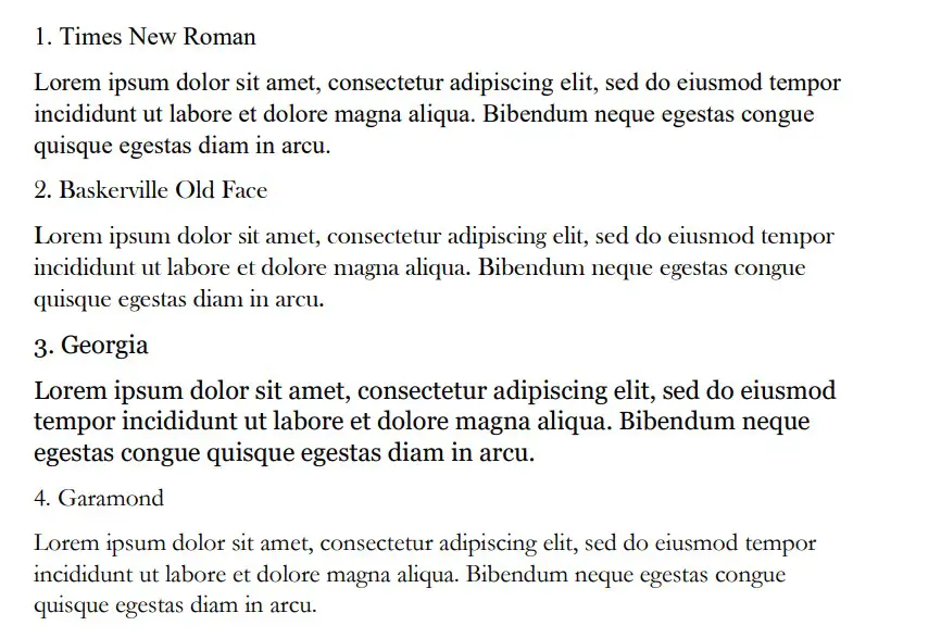
Compare the following paragraphs, both set at 12 point but in different fonts:

For body text in academic papers, type sizes below 10 point are usually too small to read easily, while type sizes above 12 point tend to look oversized and bulky. So keep the text of your paper between 10 and 12 point .
Some teachers may require you to set your whole text at 12 point. Yet virtually every book, magazine, or newspaper ever printed for visually unimpaired grown-ups sets its body type smaller than 12 point. Newspapers use even smaller type sizes. The New York Times , for example, sets its body text in a perfectly legible 8.7 point font. So with proper spacing and margins, type sizes of 11 or 10 point can be quite comfortable to read.
Font Recommendations
I usually ask my students to use Century Schoolbook or Palatino for their papers. If your teacher requires you to submit your papers in a particular font, do so. (Unless they require you to use Arial , in which case drop the class.)
One thing to consider when choosing a font is how you submit your essay. When you submit a hard copy or a PDF, your reader will see the text in whatever typeface you use. Most electronic submission formats, on the other hand, can only use the fonts available on the reader’s computer. So if you submit the paper electronically, be sure to use a font your instructor has.
What follows is a list of some widely available, highly legible serif fonts well-suited for academic papers. I’ve divided them into four categories: Microsoft Word Fonts, Mac OS Fonts, Google Fonts, and Universal Fonts.
Microsoft Word Fonts
Microsoft Word comes with lots of fonts of varying quality. If your teacher asks you to submit your paper in Word format, you can safely assume they have Word and all the fonts that go with it.

Morris Fuller Benton designed Century Schoolbook in 1923 for elementary-school textbooks, so it’s a highly readable font. It’s one of the best fonts available with Microsoft Word. Because it’s so legible, U. S. Supreme Court Rule 33.1.b madates that all legal documents submitted to the Court be set in Century Schoolbook or a similar Century-style font.

Hermann Zapf designed Palatino in 1948 for titles and headings, but its elegant proportions make it a good font for body text. Named for Renaissance calligrapher Giambattista Palatino, this font has the beauty, harmony, and grace of fine handwriting. Palatino Linotype is the name of the font included with Microsoft Word; Mac OS includes a version of the same typeface called simply Palatino.
Microsoft Word includes several other fonts that can work well for academic essays: Bell MT , Californian FB , Calisto MT , Cambria , Garamond , and Goudy Old Style .
Mac OS Fonts
Apple has a well-deserved reputation for design excellence which extends to its font library. But you can’t count on any of these Mac OS fonts being on a computer that runs Windows.

Finding his inspiration in the typography of Pierre Simon Fournier, Matthew Carter designed Charter in 1987 to look good even on crappy mid-80s fax machines and printers. Its ability to hold up even in low resolution makes Charter work superbly well on screen. Bitstream released Charter under an open license, so you can add it to your font arsenal for free. You can download Charter here .

In 1991 Apple commissioned Jonathan Hoefler to design a font that could show off the Mac’s ability to handle complex typography. The result was Hoefler Text , included with every Mac since then. The bold weight of Hoefler Text on the Mac is excessively heavy, but otherwise it’s a remarkable font: compact without being cramped, formal without being stuffy, and distinctive without being obtrusive. If you have a Mac, start using it.
Other Mac OS fonts you might consider are Baskerville and Palatino .
Google Fonts
When you submit a paper using Google Docs, you can access Google’s vast library of free fonts knowing that anyone who opens it in Google Docs will have those same fonts. Unfortunately, most of those free fonts are worth exactly what you paid for them, so choose wisely.

IBM Plex is a super-family of typefaces designed by Mike Abbink and the Bold Monday type foundry for — you guessed it — IBM. Plex serif is a solid, legible font that borrows features from Janson and Bodoni in its design. Plex is, not surprisingly, a thoroughly corporate font that aims for and achieves a bland neutrality suitable for most research papers.

John Baskerville originally designed this typeface in the 1850s, employing new techniques to make sharper contrasts between thin and thick strokes in the letter forms. The crisp, elegant design has inspired dozens of subsequent versions. Libre Baskerville is based on the American Type Founder’s 1941 version, modified to make it better for on-screen reading.
Unfortunately. Google Fonts has few really good serif fonts. Some others you might consider are Crimson Pro and Spectral .
Universal Fonts
Anyone you send your document to will have these fonts because they’re built in to both Windows and Mac OS.

Matthew Carter designed Georgia in 1993 for maximum legibility on computer screens. Georgia looks very nice on web sites, but in print it can look a bit clunky, especially when set at 12 point. Like Times New Roman, it’s on every computer and is quite easy to read. The name “Georgia” comes from a tabloid headline: “Alien Heads Found in Georgia.”

Times New Roman is, for better or worse, the standard font for academic manuscripts. Many teachers require it because it’s a solid, legible, and universally available font. Stanley Morison designed it in 1931 for The Times newspaper of London, so it’s a very efficient font and legible even at very small sizes. Times New Roman is always a safe choice. But unless your instructor requires it, you should probably use something a bit less overworked.

IMAGES
COMMENTS
Oct 7, 2023 · How to Choose the Best Font Consider the Essay Type and Purpose. The type of essay you’re writing and its purpose should guide your font choice. Formal essays benefit from serif fonts like Times New Roman, while creative pieces can experiment with script fonts like Lucida Handwriting. Prioritize Readability. Above all, prioritize readability.
Feb 26, 2024 · FAQ On The Best Fonts For Academic Papers What’s the best font for readability in academic papers? Serif fonts rule the academic roost for legibility. Times New Roman stands out; it’s visually comfortable for long reads—your thesis panel will thank you. Serifs guide the reader’s eye along lines of text, a scholarly norm.
Good academic papers deserve good academic fonts. You might not have thought too much about which font you use before, but they play a big part in whether people will take your paper seriously or not. This article will explore the best fonts for academic papers. Best Fonts for Academic Papers in Microsoft Word The … 12 Best Fonts for Academic Papers in Microsoft Word Read More »
Sep 20, 2022 · Anyway, the best font for your school essay is the one that makes your work look its best. So experiment with different fonts until you find the perfect match. And if you’re still not sure what font to use, contact an essay help professional and ask them for advice. Sometimes getting the help we need can easily solve the issue we’re ...
Jun 26, 2023 · A professional and readable sans-serif font, suitable for school essays. Ideal for school essays and professional documents. Arial: Open Sans: An accessible font with ample spacing and versatility, recommended for accessibility purposes. Best for ensuring readability for readers with disabilities or impairments. Open Sans: Times New Roman
The Modern Language Association (MLA) provides explicit, specific recommendations for the margins and spacing of academic papers. (See: Document Format.)But their advice on font selection is less precise: “Always choose an easily readable typeface (e.g. Times New Roman) in which the regular style contrasts clearly with the italic, and set it to a standard size (e.g. 12 point)” (MLA ...